In thriller films, there is always stereotypical conventions that the audience expect to see during the film. Which include:
WHAT IS A THRILLER?
. A protagonist and antagonist in a battle, when there is a disruption between the equilibrium.
. The story can usually have a chain/trail of bad events, building tension, and a dramatic climax.
. The protagonist aims to restore justice, while the antagonist seeks to destroy it.
. Low key lighting
CONVENTIONS:
. Quick cuts
. Shadows
.Changes in the angle of shots.
. Tension music- builds a climax.
.Diegetic sound of breathing.
.Montage of shots.
.Black and white shots.
.Protagonist is in mercy of the antagonist.
CHARACTERS:
The protagonist is usually a brave male, who seeks to restore the equilibrium,
The antagonist will have a hidden identity, that is revealed to the audience through certain events in the film. Sometimes, the antagonist seeks revenge because of a past event.
THEMES:
The basic idea of thriller films, tries to make the events that occur seem out of the ordinary, but also be relatabe and will make the audience feel scared. Unlike gore-horrors, which contain zombies, althlougn the film can be jumpy and scary, the audience knows its not real, and therefore is not as scared. In thrillers, kidnapping can be a frightful factor in the film, but it can happen to anyone, which makes the film appear more scary.
CINEMATOGRAPHY:
There is usually a lot of extreme close ups and close ups of the protagonist, this enables the audience to see their facial expressions and emotion. It can also be used to show the props used in the film. The antagonist however, will have quick cuts or snap-shots of their face, in able to hide their identity. Silhouettes are also frequently used, to show the figure of the antagonist and their body language.
EDITING:
Jump cuts are commonly used to create a tense atmosphere. They also allow the audience to see quick snip-its of an object or character, which will make them want to carry on watching the film, so they can reveal what happens. Cross cutting is also used to help build the suspense and the dramatic climax.
SOUND:
Sound is an essential part of any film, it helps to emphasize the emotion of the characters. In thrillers, a fast tempo can be used to build the dramatic climax, and build tension to the film. However, also slow tempo music can be used, in order to create that eerie atmosphere.
MISE EN SCENE:
costumes- antagonist is usually in dark clothing, usually black, to make them appear more scary and sinister. Usually have a hood up to hide their identity, or have a balaclava. The protagonist will be wearing ordinary, simplistic clothes to help emphasize their innocence. Filmstoke can be black and white or in colour, fine grain or grainy. The lighting is often low key, to create suspicion and suspense. The location is usually somewhere local, such as shopping malls and hotels to make the film more relatable, but also very quiet places such as the woods or abandoned places, so that there is no witnesses there. The location is important as it helps to establish the theme.
EXAMPLES:
The Hunger Games
James Bond
Taken 1,2 and 3
The Dark Knight
Kingsman
Prisioners
Bridge of spies
Shutter island
Mission impossible
88 minutes
zodiac
Panic room
Vertigo
Sunday, 20 December 2015
Saturday, 19 December 2015
Font &Title Research
We have decided to call our film- "The Alley". We feel that this name corresponds well with the content in our film. An alleyway is also where our film takes place, so it seems logical for the title to have an association with that. The title of our film is very important. We have to get the correct colour, size and font, in order to achieve a successful title. This post shows my research into what kind of font we want for our film.

This is our first font which we like. The handwriting looks jerky and odd, which creates a sinister emotion, which ties in nicely with the content in our film. Looking at the letter "E" and "Y" especially, the tail of the letter swoops downwards, and looks like it is out of control. Onto the colouring. The primary colour used here is red, with a black outline. Red holds connotations with blood and danger, which corresponds with the actions that happen in our film. The use of the black outline helps the red centre colour to stand out more, this will draw our audience in more, and will make them more captivated, as the font is so brightly coloured. Next, onto sizing. The sizing of this font is in 120. I feel this is too small, to improve it, i would go with a font size of 150, as this would maximise the lettering, so the layout of the writing looks more endearing. As our film name is short, and both the words are monosyllabic, we don't want our font size to be too big, that it covers the entire screen. I feel keeping a specific background colour will help to enhance the title, and our film. All the letters are joint together, excluding the letter "Y". This makes the font seem odd and unique. It would make the audience feel puzzled as to why one letter is not connected to the rest. This kind of emotion we want to keep for our audience. One of the main concept of thriller films is to keep the dramatic climax. We feel this font has that uniqueness to maintain that concept.

The next font I like is very different. For starters it is a different colour, and it is also not 3D. I chose the colour black, as it holds thoughts of empowerment and death which are two themes closely related to our film. The use of the white background, against the black handwriting could link to the idea of good vs bad. The font also reflects this, as the black ( the bad) is over/ higher than the white ( the good) showing that evil is overcoming the good, which will make our audience feel more threatened/ cautious as it relates to our film when Rosemary kills innocent Tara. Unlike the other text, the letters are not connected together. Suggesting that the assault/murder is puzzling and hard to work out. This withholds the puzzling nature that thriller films have, by maintaining that mystery and dramatic climax. Again the letter "Y" is elongated, creating that jagged- look that appears abnormal and mysterious. This further maintains that mystery that we want to hold with our film. Furthermore, as the end letter is the most abnormal-looking, it suggests that at the end of the film something shocking could happen...


 I used this grid to help me work out the colouring for our title. As shown, the colour black shows sophisticated, evil and death. ( which are aspects shown in our film) Whereas, the colour pink shows romance, love and beauty ( which are not seen In our film.) This grid helped to inform me about colours and their connotations, which we will to help us initiate the colour for our selected font. I feel the colour of the font, will reflect on the theme and mood of the film. Black has positive and negative thoughts, which will help to engage our audience, and be able to successfully achieve that dramatic climax that we want.
This is our first font which we like. The handwriting looks jerky and odd, which creates a sinister emotion, which ties in nicely with the content in our film. Looking at the letter "E" and "Y" especially, the tail of the letter swoops downwards, and looks like it is out of control. Onto the colouring. The primary colour used here is red, with a black outline. Red holds connotations with blood and danger, which corresponds with the actions that happen in our film. The use of the black outline helps the red centre colour to stand out more, this will draw our audience in more, and will make them more captivated, as the font is so brightly coloured. Next, onto sizing. The sizing of this font is in 120. I feel this is too small, to improve it, i would go with a font size of 150, as this would maximise the lettering, so the layout of the writing looks more endearing. As our film name is short, and both the words are monosyllabic, we don't want our font size to be too big, that it covers the entire screen. I feel keeping a specific background colour will help to enhance the title, and our film. All the letters are joint together, excluding the letter "Y". This makes the font seem odd and unique. It would make the audience feel puzzled as to why one letter is not connected to the rest. This kind of emotion we want to keep for our audience. One of the main concept of thriller films is to keep the dramatic climax. We feel this font has that uniqueness to maintain that concept.
The next font I like is very different. For starters it is a different colour, and it is also not 3D. I chose the colour black, as it holds thoughts of empowerment and death which are two themes closely related to our film. The use of the white background, against the black handwriting could link to the idea of good vs bad. The font also reflects this, as the black ( the bad) is over/ higher than the white ( the good) showing that evil is overcoming the good, which will make our audience feel more threatened/ cautious as it relates to our film when Rosemary kills innocent Tara. Unlike the other text, the letters are not connected together. Suggesting that the assault/murder is puzzling and hard to work out. This withholds the puzzling nature that thriller films have, by maintaining that mystery and dramatic climax. Again the letter "Y" is elongated, creating that jagged- look that appears abnormal and mysterious. This further maintains that mystery that we want to hold with our film. Furthermore, as the end letter is the most abnormal-looking, it suggests that at the end of the film something shocking could happen...

The next font I liked, is this one. The handwriting in general looks like scratch marks caused by a monster or zombie. However, this could be seen as a disadvantage, as our genre is a thriller, not a horror, so the audience may question why the font looks like scratch marks. Again, the colour of this font is black. Personally, I think black is the most effective as its formal, but can alternatively be seen as sinister and powerful. We don't want out font to be overbearing or look too cliché. What I mean by cliché, is the classic font with blood dropping from the letters. We feel this does not fit to our film, as there is no blood content in our opening two minutes, and is not very unique or individual, as many films use this type of font. The ending of a lot of the letters are sharp and pointy. This suggests thoughts of a knife, or a sword. These items can be associated with pain and danger, which fits the conventions of a thriller film. Furthermore, the jagged-ness of the lettering appears abnormal and qwerky. The letters do not follow that simplistic nature that ordinary letters usually have. This will make our audience feel tense, and on edge, as they make question the jagged letters and wonder why they look different. This will further make them think that our film has some uneasy scenes, and some abnormal or shocking behaviour included.

This font here, is fairly similar to the one above. However, this font in particular is far more elongated than all the others. This suggests that there is a deeper or more depthful twist to our film, due to the letters being
so long. As mentioned already, we want to keep the colour black. Black holds the idea of sinister thoughts, but also power and formality, which we want to withhold in our film. Although the letters are thin, the lettering is also fairly bold, which creates a nice contrast comparing the thin/long letters with a bold black line. Moreover, the font also looks like scratch marks on a wall. It appears like someone/something has got their claws or nails and engraved It on the wall themselves. Although this doesn't happen in our film, it still holds negative connotations that will keep our audience on edge, and still maintain that dramatic climax that we want to achieve. The elongated letters, could also link to our film, as the alleyway where our film is situated is very long. Thus, it shows a clear, directing link to the film or where the main act takes place.
I also really liked this font. There were two main features that stands out the most to me .The first is that there is no capital letters. Capital letters are always used for film titles ( grammatically speaking) and this particular font does not have this. This suggests that the film is unique and different, and has a unusual twist to it. I was pleasantly surprised that this font does not have a capital letter, as although its not the correct way of writing the title, it shows more individuality and uniqueness, which we think corresponds nicely with our film. The second thing that caught my attention was the font In general. The font to me looks like tree branches. This links nicely to our film, as the woods is where it is where the majority of our opening two minutes is filmed. This again, shows a direct link to our film through the font used. The font also has gaps in it, which are white. This could suggest a sense of good and evil, and that the "good" (white) is trying to peep through, but the "bad" ( black) is overtaking it. This suggests that the content of our film has a lot of negative aspects, but also a tiny bit of good or innocence as well.
I used this grid to help me work out the colouring for our title. As shown, the colour black shows sophisticated, evil and death. ( which are aspects shown in our film) Whereas, the colour pink shows romance, love and beauty ( which are not seen In our film.) This grid helped to inform me about colours and their connotations, which we will to help us initiate the colour for our selected font. I feel the colour of the font, will reflect on the theme and mood of the film. Black has positive and negative thoughts, which will help to engage our audience, and be able to successfully achieve that dramatic climax that we want. Thursday, 17 December 2015
Progress Targets
On return we begin the post production stage of our journey and editing begins from the onset - make sure you are video blogging and keeping your page relevant and up to date. Make sure you have evidenced all the following areas of focus over the break to maximise your marks for research and planning. The numbers reflect the amount of posts expected, at least. You are capable of exceptional attainment here - grab it!
Research
•Genre Research 10
•Soundtrack research (non copyright music) 1/2
•Costume and location research – google earth and pictures you’ve taken. 1/2
•Actors and props photos and interviews 3/5
•Audience Research and Profiling (typical audience member and similar films) 1
•Uploaded YouTube videos of openings – analysed 15/20
•Opening titles analysed in detail – font researched 1
•Analysed Film Openings from from your genre in particular 5/10
•Institution research (Paramount etc) 1
•Certificate research 1
Planning
•Own film idea brainstorm 1
•Own film treatment 1
•Relevant Online Tutorials and Comment 4/5
•Documenting of influences on production 1
•Shot lists 1
•Consideration of representation in your film and stereotyping – use theory from G322. 1
•Questionnaire (and feedback) Get some feedback on your initial ideas!
•Diary of filming/editing etc with photos and screen grabs
•Mood board 1
•Script 1
•Practice titles created and uploaded 1
•Storyboard – animatic.1
Tuesday, 15 December 2015
Questionnaire Results
From our questionnaire we got a full range of results, that will help us determine what film we want to produce. It was important to gather results from a different range of the general public, so that our results weren't biased to one age group, or one particular gender. The results will also help us determine what aspects we want in our film, such as how people are going to die, and what weapons we will use.


Question one response:

Question two Response:

Question three Response:

Question Four Response:
Question Five Response:

Question Six Response:

Question Seven Response:

From our results we have concluded that most people like horrors and thrillers. We will use this information to help us decide which is the best genre to go with. From question two, we found out that the majority of people think that "murder" is the most stereotypical thing to happen in a thriller film. In our film, we want to consider what other people like, but also have our own individuality to it as well. Thus, we are going to include a murder scene, but the protagonist will be still alive, without the antagonist knowing. From question 5, we found out that the majority of people like the name "Alleyway". To add our own individuality, we have decided to call our film "The Alley." We feel this is an effective name, as its short, snappy and quick. Similarly to the assault scene.
Friday, 11 December 2015
Behind the scenes of Assault Scene.
This blog post, shows you what we got up to in our second location ( the woods.) We spent almost 3 hours filming there, as it took us a while to get into character, without us laughing.
 Here, we can see our protagonist walking the dog up the ramp. We can see Mae recording the footage on the Nikon camera. We got this shot in the first take, as it wasn't too hard to film. The pathway is effective, as it suggests to the audience that its a place that you're allowed to walk down. It creates suspense, as the audience would want to know where the pathway leads to. The tripod was particularly useful in all our filming. without the tripod, our footage would have been uneasy and jolted, especially with the woodland air/wind which made the trees move more, creating more wind, which would make the camera move more.
 Here, we can see the "death" scene being presented. To film this close up, I had to actually get onto the floor- ( which wasn't the comfiest place to lay on). We had to make sure I was laying down in a realistic position. We found it difficult to not make the position looked to staged, as it came across really unrealistic. Also, we decided to get a shot of my eyes open to the camera, as we had to think logically what people do when they die. They do not usually have their eyes closed, so I had to film with them open. This as you can probably presume, was much easier said than done. The light shining though the trees, made it hard for me not to blink. So, we had to change my head position, so that my eyes weren't being blocked by the sun.
 Here, we have a funny shot of the antagonist and protagonist. We feel its important to show our audience the realization that the assault was not real and was all just acting. We are all close friends, so it made it more funny than hurtful, to pretend to kill each other. The bag that Rosemary uses to kill Tara is shown here in this picture. We were not sure whether we were aloud to suffocate someone in our film, as it could break the rules from the exam board. Our teacher emailed our given exam board, and they stated that we could not show the suffocation with a full bag over the head. Instead we took separate shots of the mouth and the nose. With one shot just of the mouth being covered, but the nose being out, and another with the nose being covered, but the mouth being out. This may sound a little confusing, so we took pictures on the day to visually demonstrate what we were doing.
Here, is a quick 15 second video of all of us filming. I showed you a sneak peak of what we were getting up to. We were trying to record Katy and Chloe having their discussion, but it was much harder to film, as Katy found it difficult to stop laughing. Im not in this scene, so i thought it would be a prime opportunity to do some behind the scenes blogging, to see what we got up to. Mae is directing in this part, and did a good job of it too.

Here, we have Mae filming at a cantered angle, with the greenery and branches in the background. The use of the bridge being incorporated in the shot is effective, as it shows two parts of land being connected together, suggesting that the other side has something different there. The cantered angle helps to create a mysterious vibe, as the shot appears to be jagged and not an ordinary shot. As well as the shot being cantered, it is also a low angle shot. This is effective, as it shows Nadiye being powerful and authoritative as the camera is looking up at her. This would have given her prevalence in the scene, which makes the audience empathize with her.
SAFETY ON SET- NO ONE WAS HARMED DURING THE MAKING OF THIS FILM!
 We had to ensure that everyone was safe and not at any risk during filming. Especially using a plastic bag to be suffocated in, everything had to be done properly, as our film, has a few risky scenes. As mentioned, when filming with the plastic bag, we cut holes in the nose and mouth so that i was still able to breathe efficiently. To film the suffocation, we filmed one part- with my mouth in shot, but my nose out, like shown in the photograph so that i was still breathing, and then vise-versa, when filming my nose being covered, i could still breathe through my mouth. We managed to do this, through filming through extreme close ups.
 We tied the bag behind my head with a rubber band, this ensured that the bag wouldn't blow off my head, as it was very windy in the woods. Having the bag transparent, made the assault look more sinister, as you could see my facial features ( mouth and nose) struggling to get the bag off my head.
 Here, we can see our protagonist walking the dog up the ramp. We can see Mae recording the footage on the Nikon camera. We got this shot in the first take, as it wasn't too hard to film. The pathway is effective, as it suggests to the audience that its a place that you're allowed to walk down. It creates suspense, as the audience would want to know where the pathway leads to. The tripod was particularly useful in all our filming. without the tripod, our footage would have been uneasy and jolted, especially with the woodland air/wind which made the trees move more, creating more wind, which would make the camera move more.
 Here, we have a funny shot of the antagonist and protagonist. We feel its important to show our audience the realization that the assault was not real and was all just acting. We are all close friends, so it made it more funny than hurtful, to pretend to kill each other. The bag that Rosemary uses to kill Tara is shown here in this picture. We were not sure whether we were aloud to suffocate someone in our film, as it could break the rules from the exam board. Our teacher emailed our given exam board, and they stated that we could not show the suffocation with a full bag over the head. Instead we took separate shots of the mouth and the nose. With one shot just of the mouth being covered, but the nose being out, and another with the nose being covered, but the mouth being out. This may sound a little confusing, so we took pictures on the day to visually demonstrate what we were doing.
Here, we have Mae filming at a cantered angle, with the greenery and branches in the background. The use of the bridge being incorporated in the shot is effective, as it shows two parts of land being connected together, suggesting that the other side has something different there. The cantered angle helps to create a mysterious vibe, as the shot appears to be jagged and not an ordinary shot. As well as the shot being cantered, it is also a low angle shot. This is effective, as it shows Nadiye being powerful and authoritative as the camera is looking up at her. This would have given her prevalence in the scene, which makes the audience empathize with her.
SAFETY ON SET- NO ONE WAS HARMED DURING THE MAKING OF THIS FILM!
 We had to ensure that everyone was safe and not at any risk during filming. Especially using a plastic bag to be suffocated in, everything had to be done properly, as our film, has a few risky scenes. As mentioned, when filming with the plastic bag, we cut holes in the nose and mouth so that i was still able to breathe efficiently. To film the suffocation, we filmed one part- with my mouth in shot, but my nose out, like shown in the photograph so that i was still breathing, and then vise-versa, when filming my nose being covered, i could still breathe through my mouth. We managed to do this, through filming through extreme close ups.
Camera Angles/ Shots used in our film
Camera shots used in our film:
In our film, we used a range of different camera shots, in able to show our creativitiy learnt from our theory lessons. It was fun getting into all sorts of different positions and angles, to be able to achieve an effective shot. Some of the shots we included was:
1) Canted angle- A camera angle which is deliberately slanted to one side sometimes used for dramatic effect to help portray unease disorientation frantic or desperate action intoxication madness. We used this in our film, when recording Tara walking across the bridge. It created a more tense, and uneasy atmosphere.
2) Extreme close up shot- A shot that shows facial expressions, shows things in detail. We used this, when recording Tara's hand movement, to show the detail, and the suspense, as its a significant point in our film.
3) Mid shot- Shows some part of the subject in more detail while still giving an impression of the whole subject. Used in our film when showing the antagonist running to attack the protagonist. Also used at the coffee shop scene.
4) Over the shoulder shot- Looking from behind a person at the subject. Used in our film, in a conversation between Rosemary and Bella. Shows different their different viewpoints and perspectives.
5) Two shot- A shot of two people, framed similarly to a mid shot. Used in a conversation between Bella and Rosemary. Also used in the main assault scene.
6) Close up shot- A certain feature or part of the subject takes up the whole frame. Used in our film to show Tara's facial expressions, when being suffocated.
7) Long shot- Shows the location, and the body language of a subject. Used at the beginning, to show the location of the woods. Creates suspense/climax.
We also included some editing angles:
1) Match on Action- Match on action is a very simple but essential technique, where the perspective of the camera changes during a scene and the scene continues to flow. Used in our film in the coffee shop. Shows that we can use a range of skills, and helps the dramatic climax.
2) Shot Reverse Shot: a film technique where one character is shown looking at another character (often off-screen), and then the other character is shown looking back at the first character. Since the characters are shown facing in opposite directions, the viewer assumes that they are looking at each other. Used in our film between the conversation between Bella and Rosemary. Makes the audience feel relatable to the characters.
3) Pan: Panning is moving the camera slowly, with a smooth flow. You can pan from left or from right. Used write at the beginning of our film, shows the location/setting, gives an insight to wear the film is taking place.
3) Pan: Panning is moving the camera slowly, with a smooth flow. You can pan from left or from right. Used write at the beginning of our film, shows the location/setting, gives an insight to wear the film is taking place.
Tuesday, 8 December 2015
Questionnaire
We wanted to achieve a successful opening two minutes to our film, as to get a good idea, we had to ask the general public what they thought. We asked 20 people from a different age range and genders. We did this to ensure our results were not biased or unfair. These are the questions that we asked the general public. We feel they will help us decide upon locations for our film, the certificate and the name of the film.
Out of these genres,
which is your favourite?
- Thriller
- Horror
- Comedy
- Romance
What would you expect
to happen in a thriller film?
- Murder
- Theft
- Kidnapping
- Action
How often would you
say you go to the cinema per month?
- 1-2 times
- 3-4 times
- Over 4 times
- None of the above
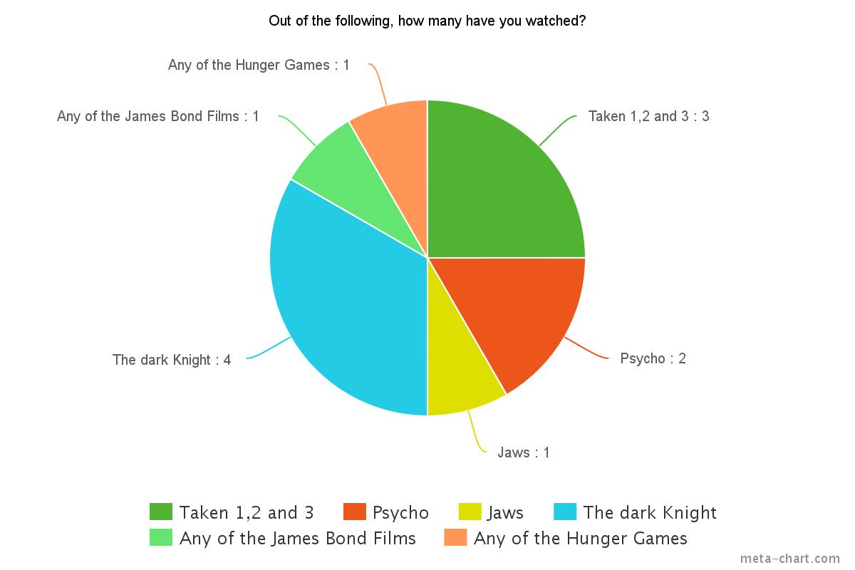
Out of the following
films, how many have you watched?
- Taken, 1, 2 or 3
- Psycho
- Jaws
- The Dark Knight
- Any of the James Bond films.
- Any of the Hunger Games
Where would you
expect a thriller to be situated?
- Woods
- City
- Shopping Centre
- Alley Way
Do you prefer having
a male or female protagonist? Why?
- Male
- Female
Which of these film
titles appeal to you the most?
- Alleyway
- The Woods
- Help!
- Missing
Monday, 7 December 2015
Location Reserch- Coffee shop
 We decided that a coffee shop would be an ideal place to film part of our clip. Coffee shops are a local and busy area that the general public enjoy going to at all points in the day. Thriller films, always have a local/ busy place shown in the film, such as restaurants ( in the James bond films) and shopping malls. This is because it shows a sense of reality to the audience. It can make the film more repeatable as people can relate to going to coffee shops, or well known places. We chose the coffee shop "Costa" to film where Tara is supposed to be meeting Ellie. We feel it was a good place, where our characters meet to catch up and have a coffee, until Ellie gets stood up, as Tara does not turn up. We also brought drinks from the shop, to emphasize the reasoning on Ellie being there. ( They were also a good treat to have while filming :) )
We decided to film in a coffee shop, rather than a restaurant. This is because we didn't want our film to appear too formal, and we thought that a restaurant would would do this. The coffee shop is welcoming and homely, which makes the audience feel like they are part of the film.
 In this photograph, i drew boxes around two of the key props that we used at costa. The Larger box, is circulating around the handbag. We thought it was important to include a bag, so that it made our character look more realistic. It could also suggest that she is not seen as a child, as children dont usually have handbags. This suggests that she is aged 16+. Furthermore, the handbag is black, which could be seen as evil, and mysterious, but also seen as formal and sophisticated. We like the idea of both, as it creates a sense of mystery to our film.
The second, smaller box I circled was the coffee cup. We brought hot-chocolates from the shop for two reasons. The first, was because we had to buy an item from the shop, in able to film there. The second reason, was because it helps to make the film look more realistic.It helps to set the setting, and shows a clear link between the coffee shop building, and why Ellie is there.
Subscribe to:
Comments (Atom)