Institution:
 Here is a photograph of our institutions that are displayed at the beginning of our opening two minutes. We decided to place the institutions at the beginning of our film, as it enabled the audience to view who helped make the film/ who contributed towards it. In addition to this, from researching other films such as "Taken", "The Dark Knight" and "James Bond" films, they mostly had there institution's at the beginning of the film, thus it conforms to the conventions of a thriller film. The reason why we didn't put "Red Canyon Films" at the end or the middle of our film, is because we all felt that It would interrupt the dramatic atmosphere that is being built up in our film, we also felt that It wouldn't fit in well with the music as well in the background. From our research of thriller films, the audience really like to be able to engage with the film, this further supports the idea as to why we didn't put out institutions mid way through the film. One of our main priorities when making our film, was to make our audience feel the tense atmosphere which is created through factors such as: The music, Camera Work and the Content itself. So for us, the placement of the institutions was critical in ensuring we maintain the tense, dramatic climax. We decided to use this particular font, as we felt it was bold and dramatic. The use of the capital letters, ensures that the audience looks straight at what's in front of them. Also, having a white font, creates a starking contrast to the background used as-well. We used a transition called "Colour Switch" on Adobe. This allowed the colour of our image ( The Grand Canyon) to change from monochromatic to colour. This made our opening look professional and sophisticated. It also conforms to the opening scene of "Taken 2" as they used the same effect. We made sure that the font was the same on both images, as then the audience can associate both the institutions as being the same company. As us, ourselves designed the institutions/ made them up, it then gave us more independence and freedom, to decide how we wanted out audience to view them. For example, the use of fonts, music, transitions, effects, arrangement of fonts and the background image. We decided to use the Grand Canyon as our image, as we all felt that it connoted power, authority and dominance, all of which are elements shown in our film, whether its through the characters, or the certain shots used. Although, to add our own individuality, we changed the adjective "Grand" to the adjective "Red" for two reasons. Firstly, it added our own individuality and ideas to our film, which makes our film seem unique and distinct. Second, was because the colour red connotes danger, which is an aspect shown in our film. To back up this point, we looked at case studies on colour schemes that the general public looked at. They viewed colours, and then wrote down what the colours made them feel. Red, was seen as the most dangerous and alarming, so this fitted in well with the content in our film. For the second production credit, we used a tiger. Tigers connote danger also, but are also a very unique animal due to their stripes. Thus, we feel this reflects the content in our film, as we feel that the idea of "suffocation" is a rare and unique way of killing someone, as it is not used that commonly in thriller films.
  Camera work:
In our film we used a range of different camera shots. We used mainly medium shots, as they allowed us to see most of the background and main subject. We also used a lot of close ups, as this created suspense, mainly due to the fact that the audience can see a minimal amount of aspects in the frame. The close up of the hand for example, creates a tense atmosphere, as the hand is moving which is a crucial part in our film. It creates a rift in our film, as it then changes the untold storyline in our film. To intensify this, we added a non copywrited sound effect of a "Boom" as this exaggerated the importance of the shot, and the importance it added to our film. I feel that close ups can intensify the significance of things too. The shot is also effective, as it tells the audience that its a female on the ground, through the use of nail varnish. We made sure that the nail vanish was chipped and looked tacky, as otherwise it would look unrealistic and wouldn't suit the vibe that is being created in the shot. We used countless numbers of close up's as it conforms to thriller films, as they create tension which the target audience like to see when watching a thriller film. Furthermore, the use of close up shots allows us to shorten the duration of the shot, reinforcing tension, suspense and the dramatic climax. In comparison, we also used long duration shots, such as the "Pan" movement used in picture one here ^. This created tension also, as it made our audience feel uneasy because they are unaware of what could come into shot, such as a person trying to attack someone. The music also helped reinforce this, as it starts witch "Chimey" music that gradually builds up. We used a tripod for mostly all of our shots, it allowed us to get a steady and well focused shot. The tripod was very handy, in the sense that it was very malleable in movement. We could adjust the height of the tri-pod as well as the angles, this made it easy to film and also made our shots look really professional. We used "Shot reverse shot" when filming the conversation between The antagonist and the antagonists sidekick. We feel that this helps the audience to engage with the two characters, as when the camera is on one character in one single frame, it makes the audience relate to them. This also involves the idea of "Prevalence" which helps the audience empathise with the character in shot.
Setting/Location:

 Props and special effects
In our film, we used a range of different props to help make our film more intense. We also used a special effect of "Cross Cutting" especially when involving the bag during the suffocation. There are two types of special effect categories; optical effects and mechanical effects. Optical effects are the effects where computer technology is needed after or during the filming, for example, SGI. Mechanical effects is where the use of props and effects which are physically used, for zombie skin make up. When filming such an intense scene, we had to make sure the safety was completely safe. To do so, our teacher emailed our exam board, enquiring about using a bag to suffocate the protagonist. They said it was okay, as long as the whole face wasn't shown with a bag over the models face. We took this advice on board, and decided to rip holes in the bag, firstly, the top half ( nose and up) and secondly, one in mouth. We then took separate shots, one showing the mouth, but with the nose out, so I could still breathe, and one showing the nose covered, but with my mouth still out. Also, we had to use two bags. One during the suffocation, which had holes in it, and another bag ( a duplicate) when Rosemary shows Bella the murder weapon used during their conversation. The main and primary prop that we used was the dog. The dog was there for two reasons. The first, was to give our antagonist a purpose for being in the woods in the first place. We found that a lot of thriller films have victims walking through desolate places, with no real purpose, so we used the dog, as a reasoning for why Tara is in the woods in the first place. The second reasoning, was because it made our antagonist appear more innocent and vulnerable. Walking your pet, is an everyday activity done by many people, so it also makes our film appear more relatable. Another prop that we used was the phone. We used an IPhone 6 (Which was also one of our characters phones) to help show communication. We found a sound effect on youtube, which showed the "Ringing" of the phone. This made our film have more suspense and create that climax, as no one answers the phone, and the audience can listen to the long, dragged out sound of a phone trying to communicate with another person. We also thought that using a phone shows a modern twist of technology used in our film, which conforms to the thriller genre.

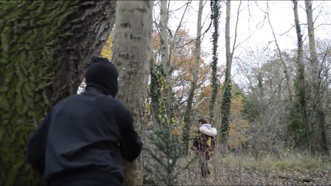
Costumes- Antagonist and Protagonist
The mise en scene was very important during our filming. We made sure that our antagonist and protagonist conformed to their stereotypes in thriller films. We feel that what the characters are wearing, portrays a lot about them as a character, so it was vital that the costumes were effective. The protagonist (The victim) - Tara is wearing a simple and yet innocent outfit. We show her in mainly long shots and medium shots, as this allows the audience to see her entire body frame, which obviously, includes what she is wearing. We decided to make our protagonist appear innocent and yet ordinary. The use of the large coat, suggests that its cold outside, meaning that people are not usually out and about in woods during the cold, winter months. The boots that Tara Is wearing are walking boots, so it conforms to the idea as to why she is in the woods. They are also brightly coloured, so the audience can clearly see where Tara is heading. The use of the normality of the clothing makes it more realistic and makes the protagonist seem more of a target. Furthermore, the protagonist Is wearing a hoodie, which conforms to teenagers is film. They are seen as lazy, un willing to do things, and un-useful, and we wanted our protagonist to come across as ordinary as possible, so the audience can relate to the character, and feel sympathetic towards her too. The protagonist is also wearing black trouser typed bottoms which we feel was effective. Firstly, the colour black connotes, death, danger, power and authority, which are all aspects shown in our film, especially during the assault. Also, black trousers conforms to the stereotype of protagonist girls, in thriller films, as they appear to be innocent and ordinary. In contrast, our antagonist had to be portrayed as the complete opposite of the protagonist, meaning being portrayed as scary, fearful and just as evil as possible. The costume, which was visible on screen, for the antagonist consisted of a black top, black bottoms, black jacket and a black baklava. As mentioned, the colour black connotes danger, power, and dominance, which our antagonist is shown to be. Using the colour black is also used in other thriller films such as "Taken3" and "The Dark Knight" so the colour conforms to the stereotype in current thriller films. The use of the head piece (The baklava) we also felt was effective. The primary reason for using the baklava, was because it hides away the antagonists identity. Thriller films stereotypically do not reveal who the antagonist is, especially if the character wants to remain unseen. However, we combined this idea, and our own individuality to make our film unique. Our antagonist took off the baklava after having performed the attack. This then surprises the audience, and will make them feel the suspense. It is also unique, as our antagonist Is a girl, which also adds diversity to our film. The antagonist is also wearing the same boots as the antagonist but in the colour black. This creates a sheer contrast between the concepts of good and evil, as the antagonists boots are black. Also, having the antagonist behind the protagonist, makes the antagonist appear more dominant and in control, which will make our audience feel suited to the film (as it conforms to thriller films) and feel the suspense that is created throughout the scene. The main shot of the antagonist is when the antagonist walks away, revealing her identity. This two shot/medium shot is effective, as Tara is lying on the ground, it will make the audience see her as weak and helpless, which 1- conforms to thriller films and 2- make the audience feel sympathy for her. In comparison, Rosemary ( the antagonist) is standing up and walking away, which makes her to appear to be the powerful and dominant person in the situation.

This picture on the left, is a picture of the titles shown in our film. I feel that this was one of the weaker parts of our production, as I feel the font and transition of the text could have been placed in a better way. These opening titles allows the audience to see who is involved in the film, from acting to producing and costume designing, which enables them to see if there is any well known actors in it. Having well known actors usually attracts audiences due to the reputation of the actors acting history and success in previous films. Our opening credits began from the very start of our film, to the very end. This then conforms to any type of film in the industry. We used effective transitions to make our titles conform to a thriller film. We used the "Smear" transition on our titles, which added a mysterious, dramatic and yet subtle effect to our titles. This then added more of an effect to our titles, and links in nicely with the content in our film. We chose to make our titles white, as this connotes purity and youthfulness, which links in with the protagonist in our film. The main reasoning for using this colour, was because we needed an appropriate colour that didn't look like it would appear unsophisticated and unprofessional. What we mean by this, is that we wouldn't want our titles to be pink, for example, as this wouldn't correspond with the content in our film, and would look silly and unprofessional. We also made sure that our credits faded in, then faded out. We don't want to take our audiences attention away from the action that is going on in the film, so if our titles suddenly jumped on the screen, then it would look messy and would distract our viewers. The font we used was called " Bold Sandscript" which help make our titles appear formal and look professional. It was also imperative, that our titles where in capitals, as this conforms to thriller films, so it shows a direct link from our film, to other thriller movies. We also made our font a reasonable size, so that it was legible for our audience, we had our font in size 100, which sounds big, but in reality was a beneficial size for our film. The titles appeared in different places on the screen, such as the corners, and centre left and centre right, this ensured that our audience would still view the titles, but would mainly be viewing the content that is going on in the film.
Title- The Alley
 This is the title that you see at the end of our opening two minutes. There is a long pause, and there is no music, before "The Alley" is pasted onto the screen. This creates a dramatic build up, and follows the basic rule of suspense to shock our target audience, this also conforms to thriller films.Having it at the end also ensures that this is the final images the audience remembers and imprinted in their minds , which would make them intrigued and wanting to watch more of "The Alley." We decided to keep the title of our film simple, yet effective. We feel that using short, monosyllabic, snappy words keeps our audience on edge, as not much Is revealed and is kept vague and ambiguous. Other thrillers such as "Taken", "Spectre" "The Revenent" are also examples of similar titles to ours. We decided to make our font of the title white, as this creates a sheer contrast to the background (which is black) using black and white together creates the idea of good vs bad, which can be seen through the antagonist and protagonist in our film. Also, as the white text is over the top of the background, it suggests that the "good" is trying to outshine/ overdo the bad, which can be seen in our film, when the best friend of Tara's ( Ellie) receives a mysterious text towards the end of the two minutes. To reinforce the suspense and tension, we cut out the soundtrack which was playing throughout the film, and then just added a "Boom" typed sound effect over the top, as the title bursts onto the screen. We feel this will shock our audience, and make them feel the suspense and tension that we hope they have felt in viewing our film.
Editing:

 Editing is an essential part of putting a film together, as it makes the whole process come together. We used "Adobe CS4" to edit our film, and put all of our shots together. We mainly used transitions such as "Fade in " and "Fade out". This made all of our shots fit nicely together, and look subtle, and mysterious at the same time. They also conform to thriller
films, as using a weird transition such as "Page turner" or "star turn" would look silly and unprofessional. We ensured that our editing was accurate and precise so it would make our opening two minutes as professional as we could and to ensure the continuity of the film. An example of our editing skills was the match-on-action of when Tara is walking across the bridge and over to the other side. We filmed one long shot of behind her, walking up to the bridge, then took a medium shot, and then a cantered angle of her walking across the bridge. The match on action is effective, as it helps to enhance the mise en scene that Tara is wearing. It also helps to keep the audience engaged as the camera work makes it look like the audience are watching at every angle, where she is heading, which creates suspense through the diegetic music playing as well. The use of the dog, helps to enhance the audiences attraction towards the film, as they can clearly see that the dog and Tara are heading into something dangerous. We also used match on action when filming Ellie at the coffee shop. This was proven to be difficult however, as we kept catching our reflections in the mirrors of the shop. This meant that we had to move ourselves and the camera in order to avoid this. ( you can view this when watching our bloopers video) We did lots of different shots around Ellie, as we really wanted the audiences attention to be around the phone. We played around with the IPhone "call settings" to change the name to Tara. This made sure that we didn't break any rules in continuity in our film. Having used two different locations in our film, it meant that we could use a more broad range of shots. Using different locations also ensures that our audience do not get bored watching the same scenery, so cross-cutting meant our film was exciting and always had different shots used. In addition to using different locations, it meant that we could use different point of view shots. This was effective as it made the audience feel like they were part of the action, which thriller films also do. Prevalence is also shown within the protagonist in the film. Prevalence shows how much screen time is shown to a particular character, and results in the audience sympathising with them. We used prevalence on Tara, as we feel this does make the audience sympathise with her, and enhances her vulnerability. Another type of editing technique used was the shot reverse shot between Rosemary and Bella. We took different shots of the girls conversation from over the shoulders. We feel that this was extremely effective, as it made the audience engage with the conversation, and also makes them feel part of the conversation. Shot reverse shot is used a lot in thriller films also. The main two transitions that we used was fading to black and cross cutting. The cross cutting helped us portray the two locations by snapping to another shot. The fading to black was effective, as it was a simplistic and sophisticated way of changing to the next scene, without it being to sharp, or overbearing for our target audience. Transitions can do 3 things. 1- Show a change in location ( what our transition we believe successfully shows) 2- imply a passage of time, and 3- emphasise a connection, perhaps between what a character is thinking about.
Storyline and Genre:
 The genre of our film is a thriller, we did this as we felt it would be fun to film, and also show diversity as most people choose to film a horror. The basic storyline of our opening two minutes shows a girl walking her dog, on her way to meet her friend, and on the way gets assaulted by a unknown character. Soon to realise, that she has been set up to kill her by another mysterious women. The audience then discover that the protagonist is still alive, through the abrupt movement of the hand. We all really like this storyline. We feel that a innocent girl getting assaulted really conforms to thriller films shown in the media today. Using the bag to suffocate the victim, we felt was very cleverly shot and though about. We feel that is was unique, as not many films involve suffocation, but rather stabbings and gun shots. From our research, we found that thriller films usually involve a antagonist trying to cause problems in the protagonists life, due to revenge from whether it be a old, historic feud in families, or if they have been set up to do it through a person of a higher social standing. We took this research on board, and decided to go through with the higher social standing aspect. In this case, Bella has set Rosemary up to kill Tara, and this leaves a slight cliff hanger as to why Bella wants Tara dead. Also, we all like watching thriller films, so we thought creating a thriller would be fun, but also we would be able to show our understanding as we watch many thriller films in our spare time. We also feel that the suspense built up from the protagonist being followed is an aspect shown a lot in thriller films. Thriller films always use the basic rule of suspense, and always have some kind of dramatic climax. Our film we feel shows this, through the music, content and acting.
 This is the title that you see at the end of our opening two minutes. There is a long pause, and there is no music, before "The Alley" is pasted onto the screen. This creates a dramatic build up, and follows the basic rule of suspense to shock our target audience, this also conforms to thriller films.Having it at the end also ensures that this is the final images the audience remembers and imprinted in their minds , which would make them intrigued and wanting to watch more of "The Alley." We decided to keep the title of our film simple, yet effective. We feel that using short, monosyllabic, snappy words keeps our audience on edge, as not much Is revealed and is kept vague and ambiguous. Other thrillers such as "Taken", "Spectre" "The Revenent" are also examples of similar titles to ours. We decided to make our font of the title white, as this creates a sheer contrast to the background (which is black) using black and white together creates the idea of good vs bad, which can be seen through the antagonist and protagonist in our film. Also, as the white text is over the top of the background, it suggests that the "good" is trying to outshine/ overdo the bad, which can be seen in our film, when the best friend of Tara's ( Ellie) receives a mysterious text towards the end of the two minutes. To reinforce the suspense and tension, we cut out the soundtrack which was playing throughout the film, and then just added a "Boom" typed sound effect over the top, as the title bursts onto the screen. We feel this will shock our audience, and make them feel the suspense and tension that we hope they have felt in viewing our film.
 Editing:

 Editing is an essential part of putting a film together, as it makes the whole process come together. We used "Adobe CS4" to edit our film, and put all of our shots together. We mainly used transitions such as "Fade in " and "Fade out". This made all of our shots fit nicely together, and look subtle, and mysterious at the same time. They also conform to thriller
 films, as using a weird transition such as "Page turner" or "star turn" would look silly and unprofessional. We ensured that our editing was accurate and precise so it would make our opening two minutes as professional as we could and to ensure the continuity of the film. An example of our editing skills was the match-on-action of when Tara is walking across the bridge and over to the other side. We filmed one long shot of behind her, walking up to the bridge, then took a medium shot, and then a cantered angle of her walking across the bridge. The match on action is effective, as it helps to enhance the mise en scene that Tara is wearing. It also helps to keep the audience engaged as the camera work makes it look like the audience are watching at every angle, where she is heading, which creates suspense through the diegetic music playing as well. The use of the dog, helps to enhance the audiences attraction towards the film, as they can clearly see that the dog and Tara are heading into something dangerous. We also used match on action when filming Ellie at the coffee shop. This was proven to be difficult however, as we kept catching our reflections in the mirrors of the shop. This meant that we had to move ourselves and the camera in order to avoid this. ( you can view this when watching our bloopers video) We did lots of different shots around Ellie, as we really wanted the audiences attention to be around the phone. We played around with the IPhone "call settings" to change the name to Tara. This made sure that we didn't break any rules in continuity in our film. Having used two different locations in our film, it meant that we could use a more broad range of shots. Using different locations also ensures that our audience do not get bored watching the same scenery, so cross-cutting meant our film was exciting and always had different shots used. In addition to using different locations, it meant that we could use different point of view shots. This was effective as it made the audience feel like they were part of the action, which thriller films also do. Prevalence is also shown within the protagonist in the film. Prevalence shows how much screen time is shown to a particular character, and results in the audience sympathising with them. We used prevalence on Tara, as we feel this does make the audience sympathise with her, and enhances her vulnerability. Another type of editing technique used was the shot reverse shot between Rosemary and Bella. We took different shots of the girls conversation from over the shoulders. We feel that this was extremely effective, as it made the audience engage with the conversation, and also makes them feel part of the conversation. Shot reverse shot is used a lot in thriller films also. The main two transitions that we used was fading to black and cross cutting. The cross cutting helped us portray the two locations by snapping to another shot. The fading to black was effective, as it was a simplistic and sophisticated way of changing to the next scene, without it being to sharp, or overbearing for our target audience. Transitions can do 3 things. 1- Show a change in location ( what our transition we believe successfully shows) 2- imply a passage of time, and 3- emphasise a connection, perhaps between what a character is thinking about.
Storyline and Genre: